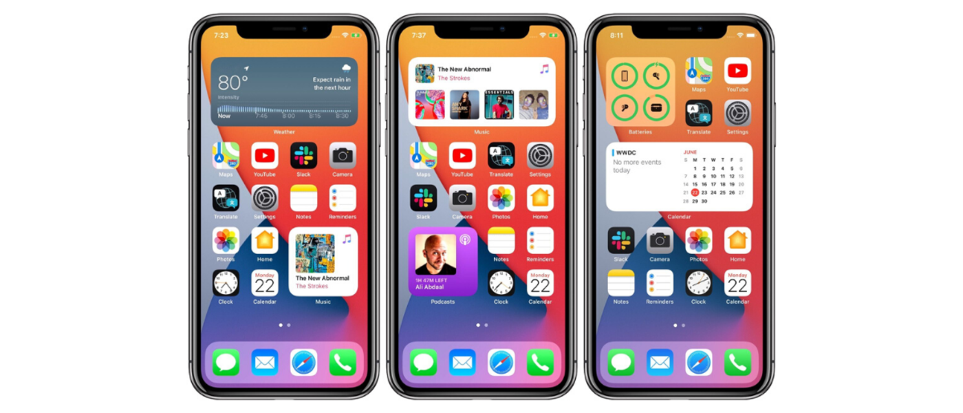
Up to this point, widgets only have existed in the Today View on iPhones. In iOS 14, widgets will be available to add directly to the home screen, mixed in with apps and other home screen elements. On the iPad, widgets will continue to live in the Today View side panel.
Rather than being siloed on a separate page of the device, widgets on the home screen allow users to instantly view and access app content. iOS 14 widgets offer users another way they can personalize their devices and put important information surfaced from apps at their fingertips.
So, how do you earn a coveted spot on a user’s home screen?
Five iOS 14 Widget Design Tips
To help ensure your app’s widget gets a top spot on users’ devices, here are some tips for designing a useful, high-quality widget.
1. Keep it Focused and Dynamic
A widget should focus on the core idea and main content of your app. The widget’s content should be dynamic, changing throughout the day. Consider how frequently your widget should update information to keep content and data fresh. Users will be more likely to prioritize your widget on their device’s home page if it displays relevant, new content each time they see it.
2. Consider Sizing Options

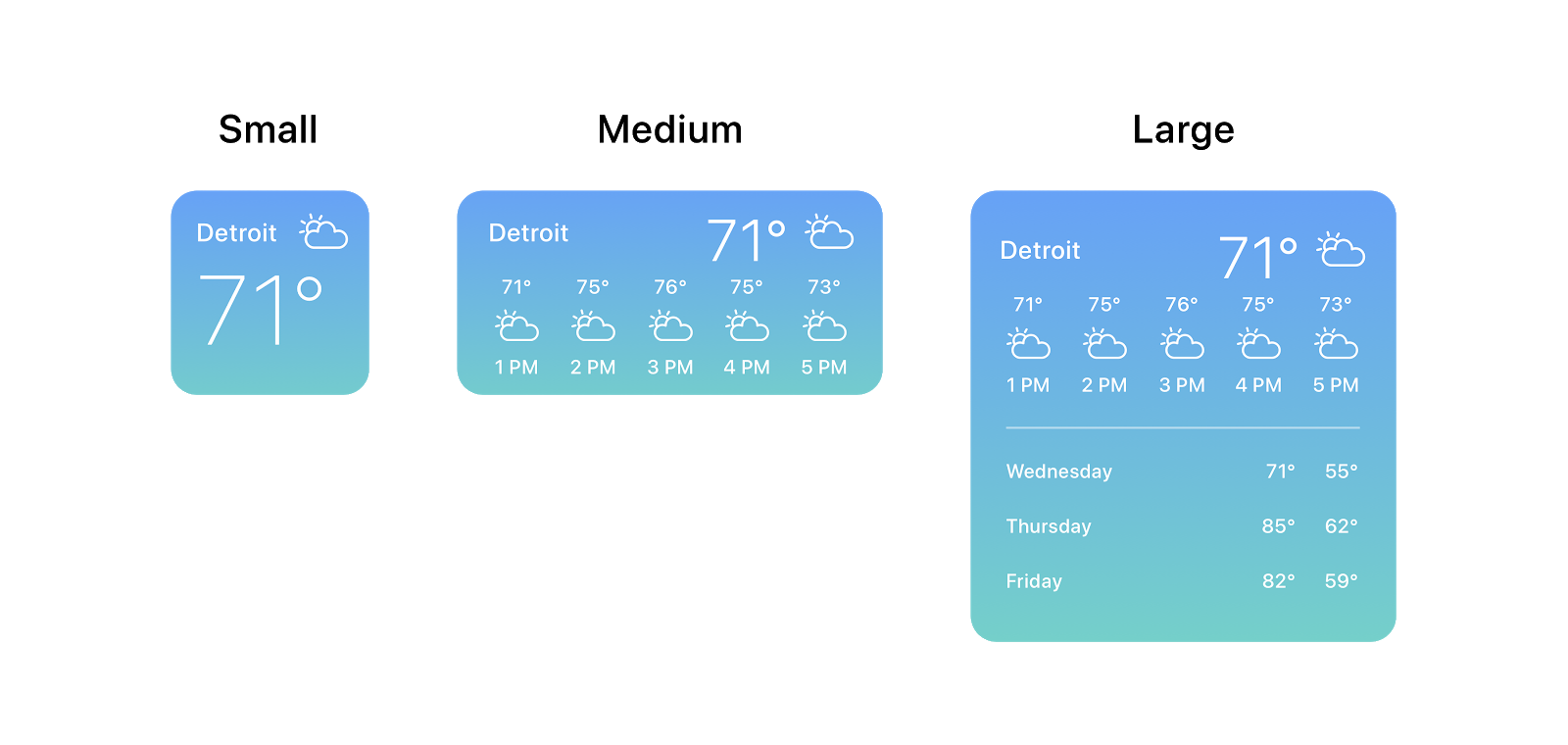
Widgets come in three sizes: small, medium, and large. You can design your widget to be any or all of these sizes. If a widget has been designed and built for multiple sizes, users can select which size to display on their home screen. Each widget size should be thoughtfully designed to display the right content and visual(s). Larger widgets allow you to show more data and information, so consider utilizing the space for data visualizations and other more robust content. Small widget content needs to be glanceable and extremely focused.
3. Address Possible Friction Points

Setup may be required by the user to make a widget’s information relevant and useful to them. For example, a weather app would need a user to specify a location to receive weather information. Keep this setup experience lightweight and easy. If your widget has additional functionality when users are authenticated, add brief messaging on the widget that helps them understand they need to log in to see personalized information in the widget. When a user taps on your widget with this messaging, they can be taken directly into your app’s log-in flow.
4. Utilize Deep Linking

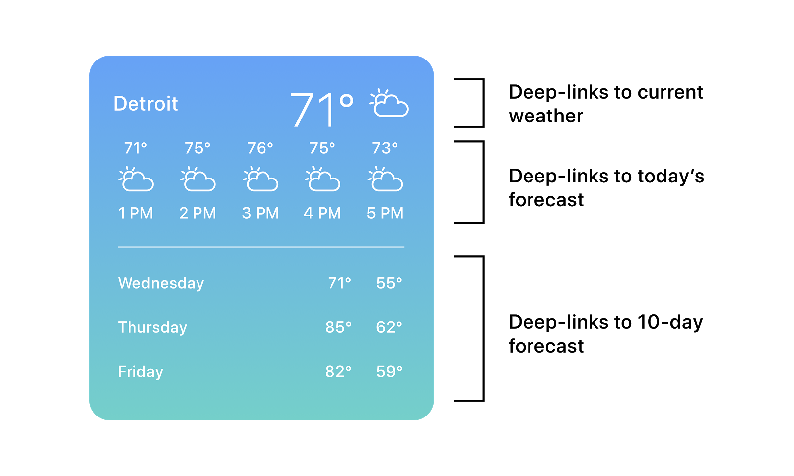
Tapping on the widget should deep link the user into the app. It should launch into content and actions that reflect the information displayed in the widget. Medium and large widgets can have multiple tap areas defined. Making use of different tap areas will help users get the information they’re looking for faster from your widget. Be thoughtful about how many interactive elements are in the widget, and don’t put tap areas too close together to avoid usability errors.
5. Bring Out the Spirit of your App and Brand

Help your widget stand out on screen, and make information easy to parse through with its visual design. Evoke the spirit of your app and brand through the widget’s visuals and colors. Bold and bright colors are recommended by Apple to capture attention and make information and visualizations easy to absorb. Add color variants to allow your widget to support Dark Mode. If your app uses a custom font, Apple recommends using it sparingly within the widget. Using the system font SF Pro for text within the widget helps ensure the widget looks cohesive with other elements on the home screen.
When thinking about designing a useful iOS 14 widget remember to:
- Think about the type of content that will be displayed and how frequently it should be updated.
- Coordinate content and visuals to suit each widget size.
- Address possible friction points, like a widget’s setup experience, that may prevent a user from adding the widget to their home screen.
- Consider which elements should be tappable, and utilize deep linking from each element to a relevant page in the app.
- Balance a lightweight and personalized experience with the spirit of your brand.
Want to receive a FREE CONSULTATION with our design, research, and strategy teams for how to create useful widgets? Get in touch.
Editor’s Note: This post was originally published on June 24, 2020 following the WWDC 2020 event. It has been updated with a summary section.


